semi合集-English.pdf - 第2648页
SEMI E95-1101 © SEMI 2000 , 2001 3 5.2.5.2 Dialog boxes con ta in a title bar at the top, a display (f ree use) area, and one or more di alog box windo w co ntro l butto ns ar range d ho rizo ntall y at the bottom. The t…
SEMI E95-1101 © SEMI 2000, 2001 2
5.2 Basic Display Objects Description
5.2.1 This section specifies the general appearance and
behavior of basic display objects used throughout the
interface, including buttons, saliences, and dialog
boxes. It is intended that the use of other types of
display objects (choose lists, data display and data entry
fields, scroll-bars, etc.) is specifically allowed, and their
use is at the discretion of the implementers.
5.2.1.1 There are two types of display objects;
selectable and non-selectable. Some are selectable by
the user to initiate or execute an action. Non-selectable
graphics and user interface elements (such as pipes and
text field labels, respectively) are read only, and no
action is initiated or executed.
5.2.2 Buttons
5.2.2.1 Button Size Mandatory
5.2.2.1.1 When a touchscreen device is used, button
sizes must be large enough to ensure selection on the
targeted display.
5.2.2.2 Button Dimensions Recommended
5.2.2.2.1 It is recommended that buttons shall have a
minimum dimension of approximately 1.5 cm on the
shortest side. If a smaller size is used, the space
between buttons must be increased to avoid selection
errors. For installations where a keyboard and a mouse,
light pen or other pointing device is available, button
sizes in the navigation panel and the command panel
may be made somewhat smaller (approximately 1–1.25
cm), and the size of the information panel increased
proportionally.
5.2.2.3 Button Behavior Mandatory
5.2.2.3.1 One type of button behavior is momentary;
that is, user selection of a button causes a brief display
of the down (selected) state of the button, followed
immediately by a display of the up (unselected) state.
The other button behavior is two-state; the button
remains in the down state after user selection. User re-
selection of the button, and/or selection of another
button, and/or selection of another display object
restores the display of the up state. In some cases, the
software will control the display of the down state or
restore the up state, without direct user interaction.
5.2.2.3.2 For 2-D buttons, the down state shall be
indicated by hatching, cross-hatching, or otherwise
texturing the button in such a manner that does not
obscure the button label.
5.2.2.4 Button Text Mandatory
5.2.2.4.1 Text for all button labels shall have the first
letter of words capitalized unless it is an article or pre-
position not occurring at the beginning or end of the
label, or unless the word’s conventional usage is not
capitalized. Button labels that are all capital letters are
harder to read than mixed case labels. Additionally, text
in all capitals appears larger, and the user may attach
more importance to the button than necessary simply
because the label is visually distracting.
5.2.3 Saliences Conditional
5.2.3.1 Saliences, colored, textured, or both shall be
displayed around buttons and other display objects to
indicate their condition, which may include caution,
alarm, user attention required or requested, processing,
unfinished task notification, and other conditions.
5.2.3.2 A salience is displayed to draw the user’s
attention to a display object when its condition is not
normal or OK (in this case, the absence of a displayed
salience shall indicate a normal or OK condition), or
when the salience provides information that benefits the
user in the performance of tasks or the monitoring of
equipment functions and operations.
5.2.3.3 A salience shall not hide the display object it
surrounds. Saliences shall not be used to indicate the
state (open, closed, on, off, etc.) of display objects.
5.2.3.4 On color displays, alarm saliences shall appear
bright red, caution saliences shall appear bright yellow,
and processing and unfinished task saliences shall
appear medium blue. User attention required or
requested saliences, (for example, “Ready to Load,” or
“Ready to Unload”) shall appear medium green.
5.2.4 Dialog Boxes Description
5.2.4.1 Dialog boxes are secondary windows used to
display supplemental information, solicit information
from the user, or report errors.
5.2.4.2 Dialog boxes are used to provide additional
information to the user; to display detailed information
not shown on the information panel for controlling the
system, and to display detailed information for
monitoring system operation.
5.2.5 Dialog Boxes Mandatory
5.2.5.1 Dialog boxes (which are always temporary) are
displayed in response to some action initiated by the
user. When displayed, a dialog box shall overlay a
portion of the information panel, and shall not obscure
the title panel. If invoked by user selection of a display
object on the information or command panels, all the
display objects on those two panels shall be disabled
until the dialog box is dismissed. The title and
navigation panels remain enabled. At the explicit
request of the user, the dialog box is dismissed, and the
underlying information is refreshed.
SEMI E95-1101 © SEMI 2000, 20013
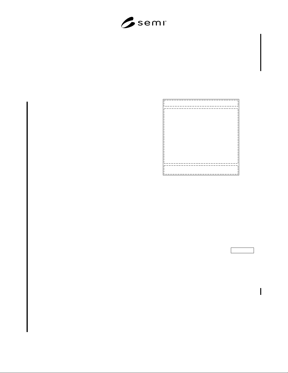
5.2.5.2 Dialog boxes contain a title bar at the top, a
display (free use) area, and one or more dialog box
window control buttons arranged horizontally at the
bottom. The title bar text reflects the command or the
nature of the event that invoked the dialog box. Dialog
box window control buttons are centered on the width
of the dialog box, with any other buttons (Apply, Log-
out, etc.) right-aligned and visually separated from the
window control buttons. If the underlying operating
system will not allow this alignment, then it is allowed
that other alignments may be used, but only if the align-
ment is consistent across all dialog boxes.
5.2.5.2.1 User selection of a dialog box control button
controls the dismissal of the dialog box and, when
applicable, controls whether the user accepts or rejects
information or choices displayed, or desires no action
be performed.
5.2.5.2.1.1 An “OK” dialog box control button, when
selected by the user, indicates acceptance of any
choices or user inputs made, if any, and causes the
dismissal of the dialog box. If no choices or user inputs
were made, selecting this button indicates acceptance of
any default values displayed. If user choices or inputs
are required, this button shall be disabled until the
choices or inputs are made.
5.2.5.2.1.2 A “Cancel” dialog box control button, when
selected by the user, indicates no action should be
taken, causes the dismissal of the dialog box, and
returns the user to the state that existed prior to the
invocation of the dialog box.
5.2.5.2.1.3 A “Yes” dialog box control button is
displayed when the dialog box message is in the form
of a question. User selection indicates a positive
response to the question asked and causes the dismissal
of the dialog box.
5.2.5.2.1.4 A “No” dialog box control button is
displayed when the dialog box message is in the form
of a question. User selection indicates no action should
be taken, causes the dismissal of the dialog box, and
returns the user to the state that existed prior to the
invocation of the dialog box.
5.2.5.2.1.5 A “Close” dialog box control button is
displayed (often as the only dialog box control button)
when the dialog box message contains only information
and does not require the user to make or accept choices,
and shall be used instead of an “OK” dialog box control
button in this case. The “Close” dialog box control
button shall also be used instead of a “Cancel” dialog
box control button when the user cannot be returned to
the state that existed prior to the invocation of the
dialog box. User selection indicates no action should be
taken and causes the dismissal of the dialog box.
5.2.5.2.1.6 An “Apply” dialog box control button,
when selected by the user, indicates acceptance of any
choices or user inputs made, if any, but does not
dismiss the dialog box. This button shall be disabled
until one or more user choices or inputs are made. After
user selection of this button, it shall be disabled until
additional choices or user inputs are made, if any.
5.2.5.3 Dialog boxes may not be resized or moved, but
may display a button equivalent to the Cancel button in
the title bar.
Dialog Title
Display (Free Use) Area
Dialog Window Control Buttons (OK, Cancel, etc.)
Figure 1
Dialog Box
5.2.5.4 Dialog boxes are classified into the following
three types:
• Information dialog box
• Data input/selection dialog box
• Message dialog box
5.2.5.5 To be compliant with this specification, at least
one of these dialog box types shall be supported.
5.2.6 Information Dialog Box Conditional
5.2.6.1 This dialog box type is used to provide addi-
tional information to the user about some display object
or topic addressed by the information panel. User
selection of a display object on the information panel
invokes an information dialog box, if appropriate for
the display object selected. The window control button
to dismiss the dialog box shall be the Close button. Use
of an OK button in this case is not allowed.
5.2.6.2 Implementation of this dialog box type shall be
conditional on the equipment having the capability of
providing the required information.
SEMI E95-1101 © SEMI 2000, 2001 4
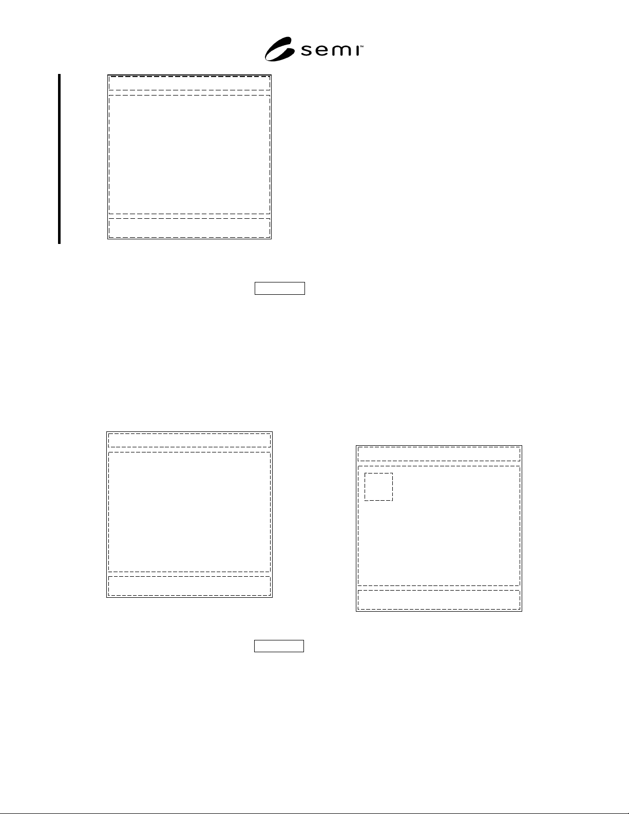
Dialog Title
Information Area
Dialog Window Control Buttons (Close, etc.)
Figure 2
Information Dialog Box
5.2.7 Input/Selection Dialog Box Conditional
5.2.7.1 This dialog box type is used to request data
input or selection from the user. If no keyboard or
keypad is available, and the user must input characters,
an on-screen representation (“mimic”) of one or both
shall be displayed as part of the dialog box. The win-
dow control buttons are the OK and Cancel buttons.
5.2.7.2 Implementation of this dialog box type shall be
conditional on the presence of display objects that allow
user input or selection.
Dialog Title
Data Input/Selection Area
Dialog Window Control Buttons (OK, Cancel, etc.)
Figure 3
Data Input/Selection Dialog Box
5.2.8 Message Dialog Box Conditional
5.2.8.1 This dialog box type is used to provide a
message to the user (including the reporting of errors)
or to request confirmation of a user initiated action. The
message text is located to the right of the icon. It is
recommended that icons from the underlying operating
system be used to represent the message type as
follows:
• Information in the form of a simple message
• Progress, informing the user of an ongoing process
• Attention, alerting the user of possible danger, or
inability to execute a command, or requesting
confirmation (either as a statement or as a
question)
• Error, informing the user of danger or inability to
execute a command (if effect is severe)
5.2.8.2 Note that most style guides no longer
recommend the use of a question mark icon when the
message is phrased as a question, as its meaning could
be ambiguous in some cases. The attention icon should
be used instead.
5.2.8.3 The first two message types use the Close
window control button. The second two use OK and
Cancel, or Yes and No (and sometimes Cancel) if the
message is phrased as a question. It is recommended
that buttons or other display objects that would cause an
error message be disabled in those circumstances.
5.2.8.4 Implementation of this dialog box type shall be
conditional on the equipment having the capability of
providing the required information.
Dialog Title
Message Area
Dialog Window Control Buttons (OK, Cancel, etc.)
Icon
Figure 4
Message Dialog Box