1.011.1_VPC使用手册.pdf - 第41页
40/144 The display shows 13 bars with the same width, each of which represents eight hours. A percentage number which displays the percentage of good PCBs (First Pass Yield) is seen in each bar. The numbers in the bracke…
39/144
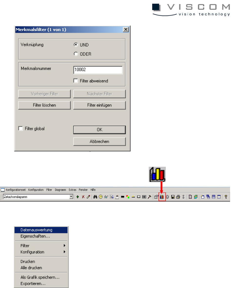
Now, with a click on "Data evaluation," under consideration of the filter settings,
all data that corresponds to the preconditions is displayed in the diagram.
During evaluation the message "Data is evaluated..." appears at the bottom left
of the image.
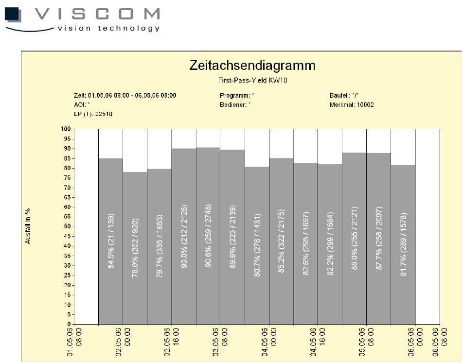
40/144
The display shows 13 bars with the same width, each of which represents eight
hours.
A percentage number which displays the percentage of good PCBs (First Pass
Yield) is seen in each bar. The numbers in the brackets give the ratio between
the defect rate and the entire run within a time period.
But because each bar contains all the inspection plans that are run during this
period on "X" machines, it might be important for the programmer to know which
inspection plan has the least number of good boards, so it can be better
optimized.
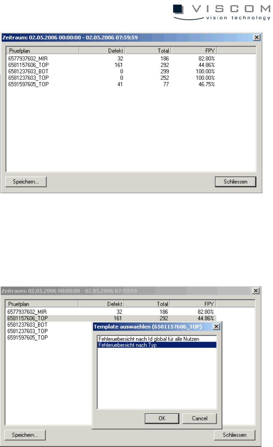
A click with the left mouse button on the second bar brings up the following
image.
Every inspection plan in the header in the particular time period is inspected in
this scroll list. The list is constructed exactly like the bar labeling.
41/144
To find out which component body type caused the rather high defect rate of
55.14% in inspection plan 2147483647_TOP, this is to be marked (see above).
A double left mouse click brings the following image.
Here, the point "Error overview by type" is chosen and confirmed with the "OK"
button.