FCM_User Reference Manual.pdf.pdf - 第20页
Hu man Inte rfac e User Re ference Manual 4022 5 91 96082 3-4 FCM Multiflex 02.02 3.2.2 D ialogue Screen Oper atio n Whenev er a function h as been selected fr om a pul l-do wn menu, a Dialogue Sc r een appears (s ee SCR…
4022 591 96082 User Reference Manual
02.02 FCM Multiflex 3-3
Human Interface
3.2.1 Menu Screen Operation
To activate an item from the menu bar, you can:
■ Press <Alt> together with the underlined letter in this item (e.g. pressing “Alt-
U” activates the “U
ser” pull-down menu).
■ Tap the touch pad on the desired menu item directly.
Activating an item from the menu bar automatically displays the pull-down menu
of this particular item.
After one item has been selected, other menu items with its pull-down menus can
be accessed by using the left or right cursor key (
← ,→).
To activate a function from the pull-down menu, you can:
■ Press the underlined letter of the function itself (e.g. pressing “h” in the “User”
pull-down menu activates the “Sh
utdown FCM Multiflex...” function)
■ Move with the up or down cursor key (
↑ , ↓) to the desired function (which will
be highlighted), and press <Enter>.
■ Tap the touch pad on the desired function directly.
Activating a function from the pull-down menu automatically accesses the dialogue
screen or switches to a next sub-menu.
NOTE: At all times the <Esc> key can be used to clear the menu screen.
Human Interface
User Reference Manual 4022 591 96082
3-4 FCM Multiflex 02.02
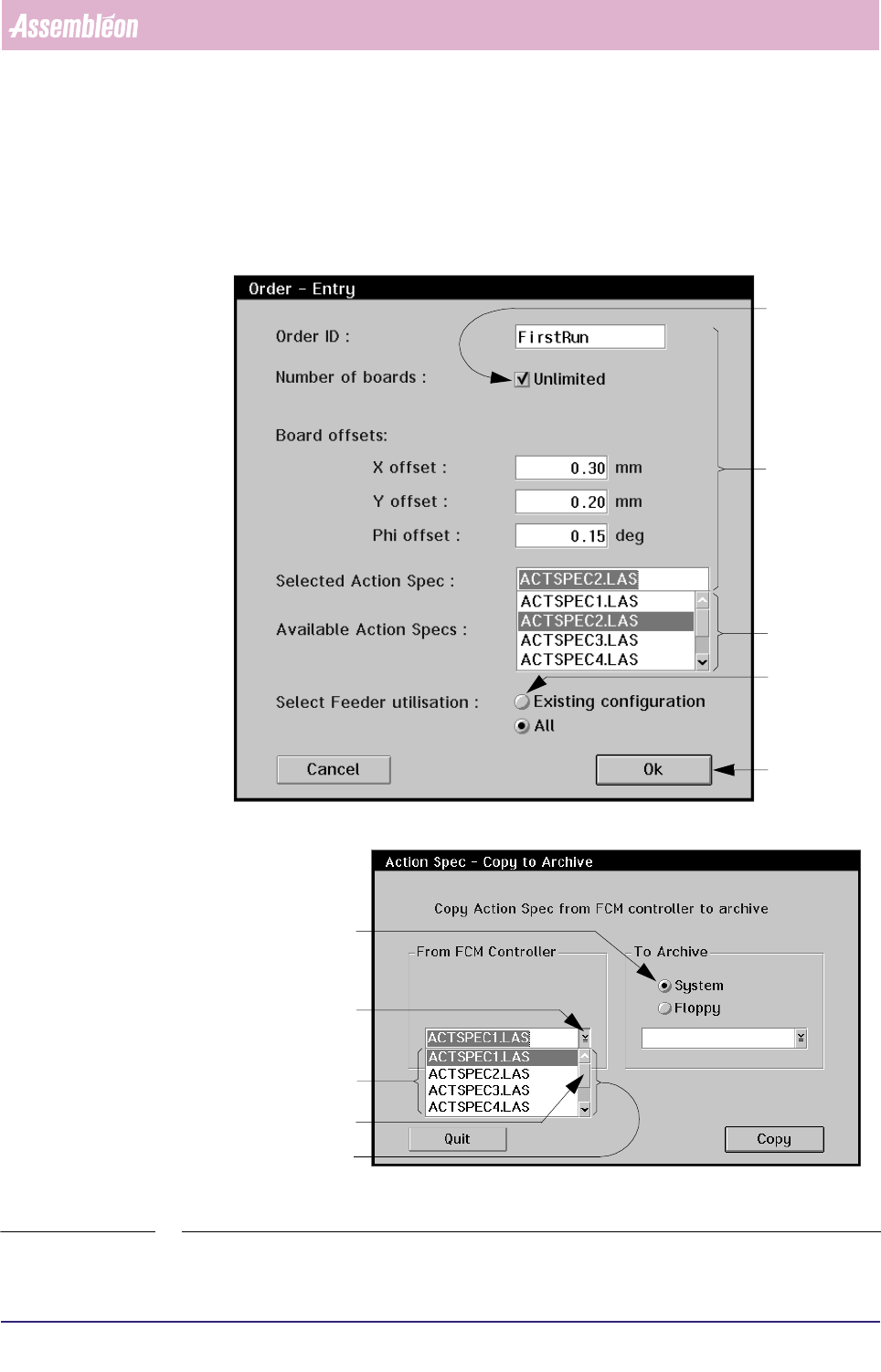
3.2.2 Dialogue Screen Operation
Whenever a function has been selected from a pull-down menu, a Dialogue Screen
appears (see SCREEN 3-4).
SCREEN 3-4 Examples of a dialogue screen
Radio Button
Drop Down Button
List Box
Slider Box
Scroll Bar
Check Box
Entry Fields
Scroll Bar
Radio Button
Push Button
4022 591 96082 User Reference Manual
02.02 FCM Multiflex 3-5
Human Interface
Moving through a dialogue screen can be done in 2 ways:
■ Pressing the <Tab> or <Shift>+<Tab> key.
■ Tapping the touch pad in the desired area.
A dialogue screen may contain the following items:
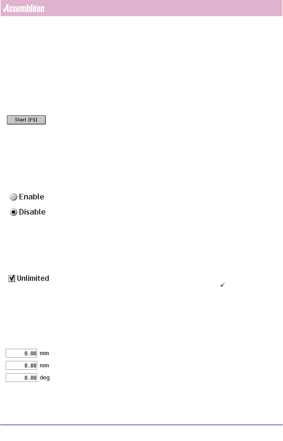
3.2.2.1 Push buttons
A push button is a rounded-corner rectangle with text inside. When activated, a
push button performs the function mentioned on the button itself. They can be
activated by:
■ Pressing the <Enter> key whenever the button is selected (dotted line around
the text). Use the
→ and ← cursor keys to switch between push buttons.
■ Tapping the touch pad on the push button
■ Pressing a function key if mentioned on the button itself (e.g “Start [F5]”).
3.2.2.2 Radio Buttons
A radio button consists of a circle and choice text. Users can select only one radio
button in each selection field. If users, after selecting one radio button, select a
different one, the previous button is no longer selected. In some cases a radio
button also performs a single function (e.g. Pusher “Down”). One radio button is
always selected as default (the circle is partially filled in). Switching between radio
buttons is done by:
■ Using the cursor keys (
↑, ↓,← and →) or
■ Tapping the touch pad on the radio button.
3.2.2.3 Check Box
A check box consists of a square box and choice text. Check boxes can be used alone
or grouped in related sets. Unlike radio buttons user can select more than one
check box. An activated check box can be identified by a “ ” mark placed within
the square box. It can be selected by:
■ Pressing the space bar
■ Tapping the touch pad on the check box.
3.2.2.4 Entry Field
An entry field consists of text and a rectangular box in which users type infor-
mation. When an entry field is first displayed, it is either blank or contains an
initial value. They can be entered by:
■ Selecting the left or right <Tab> key
■ Tapping the touch pad in the entry field.
Inside an entry field the cursor keys (
↑, ↓, → and ←), <Home>, <End>, <Delete>,
<Insert> and <Backspace> keys can be used.
Some entry fields can be filled in by selecting an item from a List Box.