RS-1_instruction manual.pdf - 第644页
Pa r t 2 D et ai l ed Des c r i pt i o n of Ea c h F unc t i o n Chapte r 6 G e neral - Purpose Vision Co mpone nt 6- 13 2) Op ening fr om the Elem ent Data s cr een Af ter mak ing sure on t he El em ent D ata s cr een t…
Part 2 Detailed Description of Each Function Chapter 6 General-Purpose Vision Component
6-12
Component Viewer 6.3
The Component Viewer allows you to display the created data on a general-purpose vision
component graphically.
Opening “Component Viewer” 6.3.1
The operating method and the contents of data to be displayed on “Component Viewer” vary
depending on the screen from which “Component Viewer” is started.
Screen from which “Component
Viewer” is opened
For editing element data Contents of display
Opening from the Vision Form screen “Component Viewer” must be closed. All element groups are displayed.
Opening from the Element Data screen
“Component Viewer” does not need to
be closed.
All element groups are displayed.
Opening from the Element Group
screen
Only the current element group is
displayed.
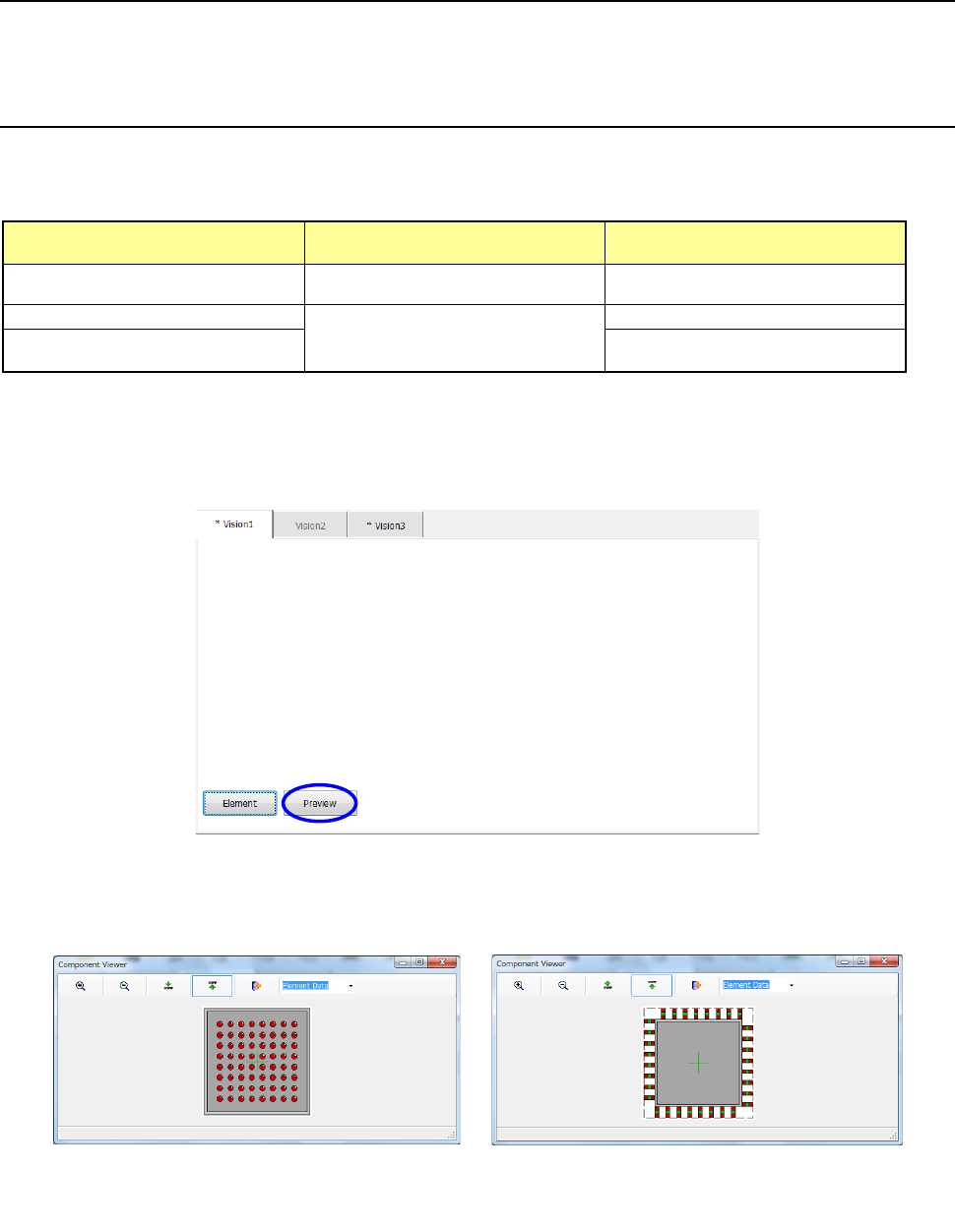
1) Opening from the Vision Form screen
When a general vision component is displayed on the Vision Form screen, the <Preview>
button is displayed on the Vision Form screen.
− Touching the <Preview> button displays the following dialog box.
Example of the
ball component screen
Example of the
lead component screen
Part 2 Detailed Description of Each Function Chapter 6 General-Purpose Vision Component
6-13
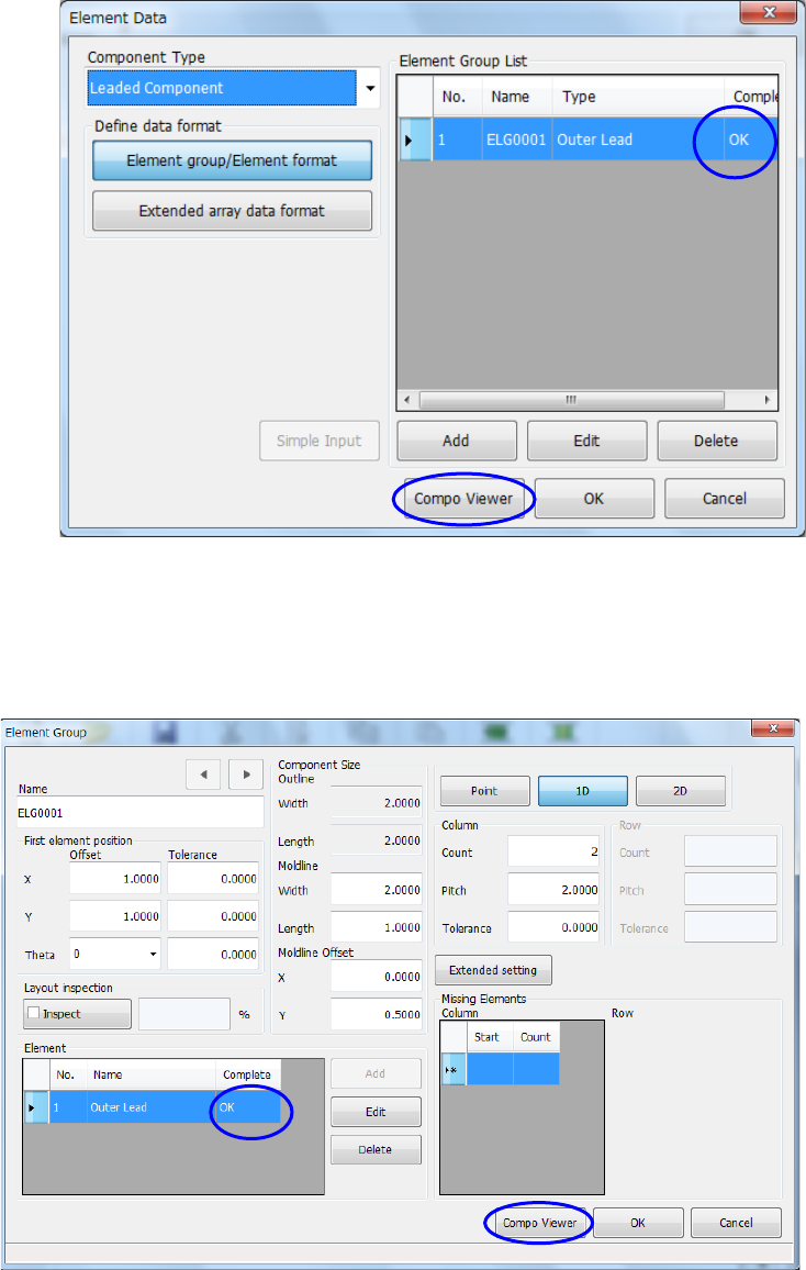
2) Opening from the Element Data screen
After making sure on the Element Data screen that element group data is completed, touch
the <Compo Viewer> button.
3) Opening from the Element Group screen
After making sure on the “Element Group” screen that element data is completed, touch the
<Compo Viewer> button.
Part 2 Detailed Description of Each Function Chapter 6 General-Purpose Vision Component
6-14
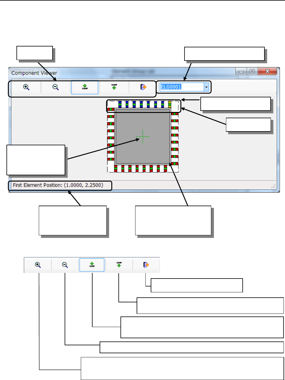
How to use “Component Viewer” 6.3.2
Select an element group from the “Element Group List” or click the element group you want to
select with a track ball. The selected element group is displayed in blue, and its first element is
displayed in yellow.
■ Tool bar
*1 If you use the Component Viewer to display the element defined on the top side so that it can be
viewed from the bottom side, or the element defined on the bottom side so that it can be viewed
from the top side, the element may become invisible.
Coordinates of the first
element of the selected
element group
Selected element group
First element
Tool bar
Element group selection list
Cross line
representing the
center of component
Component shape entered
on the "Component" data
screen(including leads)
Zoom Out: Scales down the component size 10% by clicking the icon.
Zoom In: Displays the icon in the pressed status by clicking the icon.
When you click it with the mouse left-button on the screen, the
component size is scaled up 10%.
End: Closes the Viewer.
Top View: Displays a figure of the component viewed
from the top. *1
Bottom View: Displays a figure of the component viewed from
the bottom. *1