semi合集-English.pdf - 第2649页
SEMI E95-1101 © SEMI 2000 , 2001 4 Dialog Title Information Area Dialog Window Control Buttons (Close, etc.) Figure 2 Inform ation Dialog Box 5.2.7 Input/Selection Dial og Box Condi tional 5.2.7.1 T his di alog box type …
SEMI E95-1101 © SEMI 2000, 20013
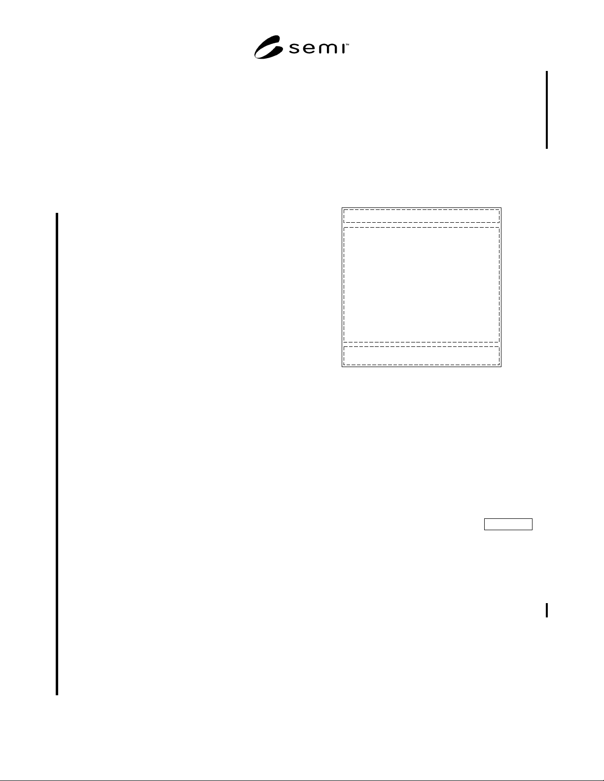
5.2.5.2 Dialog boxes contain a title bar at the top, a
display (free use) area, and one or more dialog box
window control buttons arranged horizontally at the
bottom. The title bar text reflects the command or the
nature of the event that invoked the dialog box. Dialog
box window control buttons are centered on the width
of the dialog box, with any other buttons (Apply, Log-
out, etc.) right-aligned and visually separated from the
window control buttons. If the underlying operating
system will not allow this alignment, then it is allowed
that other alignments may be used, but only if the align-
ment is consistent across all dialog boxes.
5.2.5.2.1 User selection of a dialog box control button
controls the dismissal of the dialog box and, when
applicable, controls whether the user accepts or rejects
information or choices displayed, or desires no action
be performed.
5.2.5.2.1.1 An “OK” dialog box control button, when
selected by the user, indicates acceptance of any
choices or user inputs made, if any, and causes the
dismissal of the dialog box. If no choices or user inputs
were made, selecting this button indicates acceptance of
any default values displayed. If user choices or inputs
are required, this button shall be disabled until the
choices or inputs are made.
5.2.5.2.1.2 A “Cancel” dialog box control button, when
selected by the user, indicates no action should be
taken, causes the dismissal of the dialog box, and
returns the user to the state that existed prior to the
invocation of the dialog box.
5.2.5.2.1.3 A “Yes” dialog box control button is
displayed when the dialog box message is in the form
of a question. User selection indicates a positive
response to the question asked and causes the dismissal
of the dialog box.
5.2.5.2.1.4 A “No” dialog box control button is
displayed when the dialog box message is in the form
of a question. User selection indicates no action should
be taken, causes the dismissal of the dialog box, and
returns the user to the state that existed prior to the
invocation of the dialog box.
5.2.5.2.1.5 A “Close” dialog box control button is
displayed (often as the only dialog box control button)
when the dialog box message contains only information
and does not require the user to make or accept choices,
and shall be used instead of an “OK” dialog box control
button in this case. The “Close” dialog box control
button shall also be used instead of a “Cancel” dialog
box control button when the user cannot be returned to
the state that existed prior to the invocation of the
dialog box. User selection indicates no action should be
taken and causes the dismissal of the dialog box.
5.2.5.2.1.6 An “Apply” dialog box control button,
when selected by the user, indicates acceptance of any
choices or user inputs made, if any, but does not
dismiss the dialog box. This button shall be disabled
until one or more user choices or inputs are made. After
user selection of this button, it shall be disabled until
additional choices or user inputs are made, if any.
5.2.5.3 Dialog boxes may not be resized or moved, but
may display a button equivalent to the Cancel button in
the title bar.
Dialog Title
Display (Free Use) Area
Dialog Window Control Buttons (OK, Cancel, etc.)
Figure 1
Dialog Box
5.2.5.4 Dialog boxes are classified into the following
three types:
• Information dialog box
• Data input/selection dialog box
• Message dialog box
5.2.5.5 To be compliant with this specification, at least
one of these dialog box types shall be supported.
5.2.6 Information Dialog Box Conditional
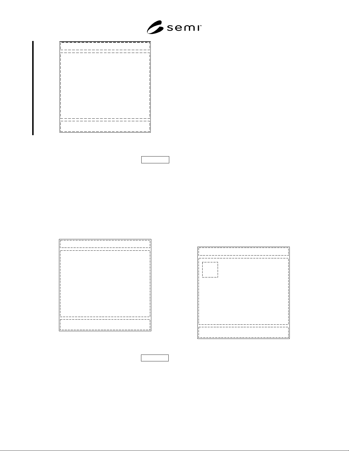
5.2.6.1 This dialog box type is used to provide addi-
tional information to the user about some display object
or topic addressed by the information panel. User
selection of a display object on the information panel
invokes an information dialog box, if appropriate for
the display object selected. The window control button
to dismiss the dialog box shall be the Close button. Use
of an OK button in this case is not allowed.
5.2.6.2 Implementation of this dialog box type shall be
conditional on the equipment having the capability of
providing the required information.
SEMI E95-1101 © SEMI 2000, 2001 4
Dialog Title
Information Area
Dialog Window Control Buttons (Close, etc.)
Figure 2
Information Dialog Box
5.2.7 Input/Selection Dialog Box Conditional
5.2.7.1 This dialog box type is used to request data
input or selection from the user. If no keyboard or
keypad is available, and the user must input characters,
an on-screen representation (“mimic”) of one or both
shall be displayed as part of the dialog box. The win-
dow control buttons are the OK and Cancel buttons.
5.2.7.2 Implementation of this dialog box type shall be
conditional on the presence of display objects that allow
user input or selection.
Dialog Title
Data Input/Selection Area
Dialog Window Control Buttons (OK, Cancel, etc.)
Figure 3
Data Input/Selection Dialog Box
5.2.8 Message Dialog Box Conditional
5.2.8.1 This dialog box type is used to provide a
message to the user (including the reporting of errors)
or to request confirmation of a user initiated action. The
message text is located to the right of the icon. It is
recommended that icons from the underlying operating
system be used to represent the message type as
follows:
• Information in the form of a simple message
• Progress, informing the user of an ongoing process
• Attention, alerting the user of possible danger, or
inability to execute a command, or requesting
confirmation (either as a statement or as a
question)
• Error, informing the user of danger or inability to
execute a command (if effect is severe)
5.2.8.2 Note that most style guides no longer
recommend the use of a question mark icon when the
message is phrased as a question, as its meaning could
be ambiguous in some cases. The attention icon should
be used instead.
5.2.8.3 The first two message types use the Close
window control button. The second two use OK and
Cancel, or Yes and No (and sometimes Cancel) if the
message is phrased as a question. It is recommended
that buttons or other display objects that would cause an
error message be disabled in those circumstances.
5.2.8.4 Implementation of this dialog box type shall be
conditional on the equipment having the capability of
providing the required information.
Dialog Title
Message Area
Dialog Window Control Buttons (OK, Cancel, etc.)
Icon
Figure 4
Message Dialog Box
SEMI E95-1101 © SEMI 2000, 20015
5.3 Basic Network Navigation Model Mandatory
5.3.1 This standard specifies a simple navigation model designed specifically to minimize the number of actions
and the amount of time required of the user.
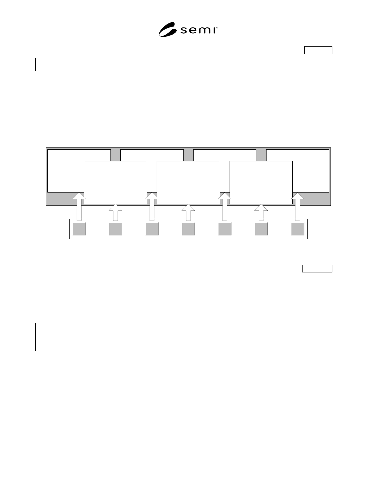
5.3.2 The basic network navigation model is capable of displaying a number of views within a single level of
hierarchy. The user does not have to traverse up and down menu or view “trees” when exercising control and
monitoring tasks. As shown in the figure below, the basic navigation model is a network, supporting horizontal
(lateral) transfer, at any time, between any of the functional areas in the interface. The basic network navigation
model does not support more than one view in any functional area. Expansion of detail for views is typically
implemented using dialog boxes.
5.3.3 Note that the diagram is schematic; it shows that user selection of a functional area shall display its associated
information panel. Only one information panel shall be displayed at any time.
Jobs System Recipes Setup (Future) Alarms Help
Information
Panel
Functional
Areas
Figure 5
Basic Network Navigational Model
5.3.4 Network Navigation Model with Sub-navigation Conditional
5.3.4.1 While maintaining the same basic structure, this navigation model supports multiple views within functional
areas on the network. If any functional area has more than one view, all functional areas in the interface shall
consistently use one of the two view sub-navigation methods described below. Lateral transfer between any of the
views within a functional area is supported either by providing a single row of tabs which may be selected to change
views (Figure 6), or by providing view sub-navigation buttons (Figure 7) in a separate screen area dedicated solely
to sub-navigation. Expansion of detail for each of these views is typically implemented using dialog boxes.
5.3.4.2 The grouping of tasks within functional areas reflects the natural flow of information, events, and tasks in a
way that is familiar to the user and that directly supports the attainment of successful process and equipment
performance goals. Functional areas are user task oriented, collecting together logically related monitoring and
control functions, reducing the need to navigate between views.
5.3.4.3 Note that the diagrams are schematic; they show that user selection of a functional area shall display its
associated information panel. Only one information panel shall be displayed at any time. Similarly, user selection of
a tab or sub-navigation button displays only one of the views available at any time.