semi合集-English.pdf - 第2657页
SEMI E95-1101 © SEMI 2000 , 2001 12 Jobs System Recipes Setup (Future) (Future) (Future) Alarms Help Medium Blue Salience Bright Red Salience Figure 16 Alarm Salience 5.4.8 Sub-navigation Conditi onal 5.4.8.1 When sub-na…
SEMI E95-1101 © SEMI 2000, 200111
ordering also. Additional buttons, if required for a particular implementation, shall be added between the Setup and
Alarm button positions.
5.4.7 Navigation Panel Saliences Conditional
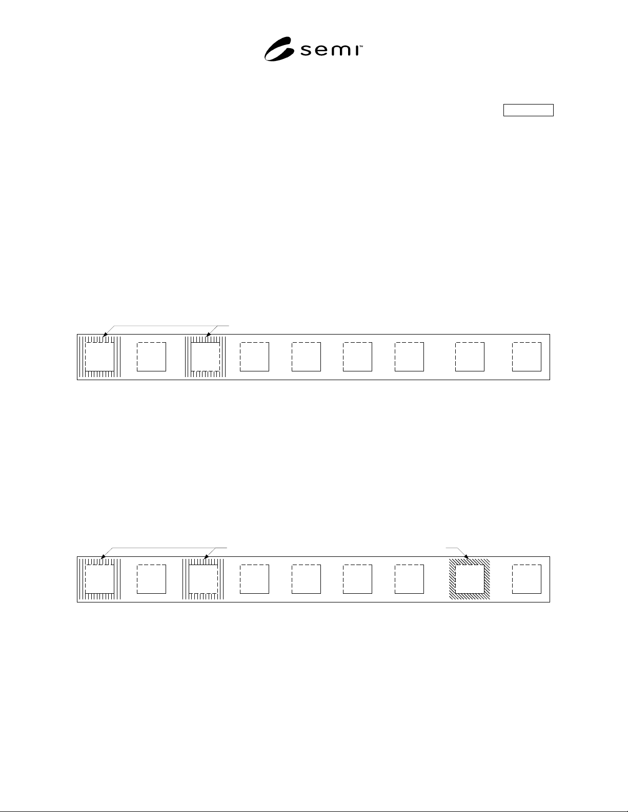
5.4.7.1 Only one navigation button at a time shall display a pressed appearance. Additionally, navigation buttons
shall display colored salience coding for a number of purposes: 1, to indicate the user is viewing a functional area
(medium blue salience); 2, to indicate an unfinished task (typically an open dialog box) in a functional area not
currently displayed (medium blue salience); and 3, to inform the user that there are new or unacknowledged cautions
or alarms (saturated yellow or saturated red salience, respectively). The caution and alarm saliences are displayed on
the Alarms navigation button only. As an example, if the user has opened a dialog box in the Jobs functional area,
and then selects the Recipes navigation button, the Recipes button shall display a pressed (down) appearance and a
medium blue salience, and the Jobs button shall display an unpressed (up) appearance and a medium blue salience
(Figure 14). This reminds the user that there is an open dialog box in the Jobs functional area. More than one
navigation button may display the unfinished task salience.
5.4.7.2 The Jobs button may also display a medium green salience (not shown) to notify the user that the equipment
is “Ready to Load,” “Ready to Unload,” “Ready to Run,” or is in a similar state such that the user’s attention is
requested in the Jobs functional area. This is useful when the user has navigated to another functional area of the
interface. If there is an unfinished task, its medium blue salience shall remain displayed, even if the user’s attention
is requested.
Jobs System Setup (Future) (Future) (Future) Alarms Help
Medium Blue Salience
Recipes
Figure 14
Navigation Button Saliences
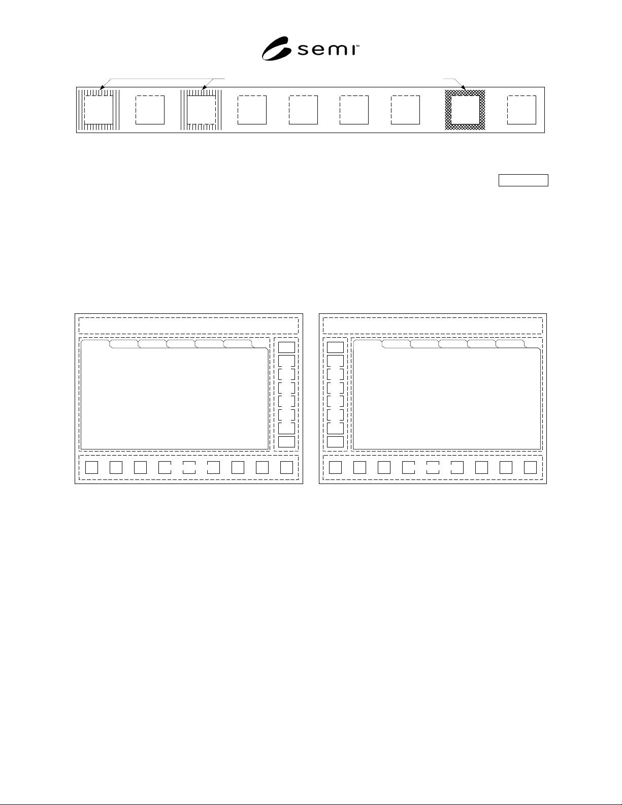
5.4.7.3 The Alarm navigation button, in addition to the medium blue salience, displays a saturated (bright) yellow
salience when there are new or unacknowledged cautions, or displays a saturated red salience when there are new or
unacknowledged alarms. Only the severest level is displayed. That is, when there are both cautions and alarms, the
red alarm salience shall be displayed. When there are no alarms and only cautions, the caution salience shall be
displayed. The figures below show the same situation as Figure 14, with Figure 15 showing a caution salience, and
Figure 16 showing an alarm salience. If there are no cautions or alarms, the Alarm button displays a medium blue
salience if the user is viewing the Alarms functional area, or if there is an unfinished task and another functional area
is being viewed. If a caution or alarm occurs, the medium blue salience is replaced with the appropriate salience, and
is only re-displayed when all cautions and alarms have been acknowledged or cleared.
Jobs System Recipes Setup (Future) (Future) (Future) Alarms Help
Bright Yellow SalienceMedium Blue Salience
Figure 15
Warning Salience
SEMI E95-1101 © SEMI 2000, 2001 12
Jobs System Recipes Setup (Future) (Future) (Future) Alarms Help
Medium Blue Salience Bright Red Salience
Figure 16
Alarm Salience
5.4.8 Sub-navigation Conditional
5.4.8.1 When sub-navigation is supported it shall be by a single row of tabs or buttons in a sub-navigation panel as
shown below.
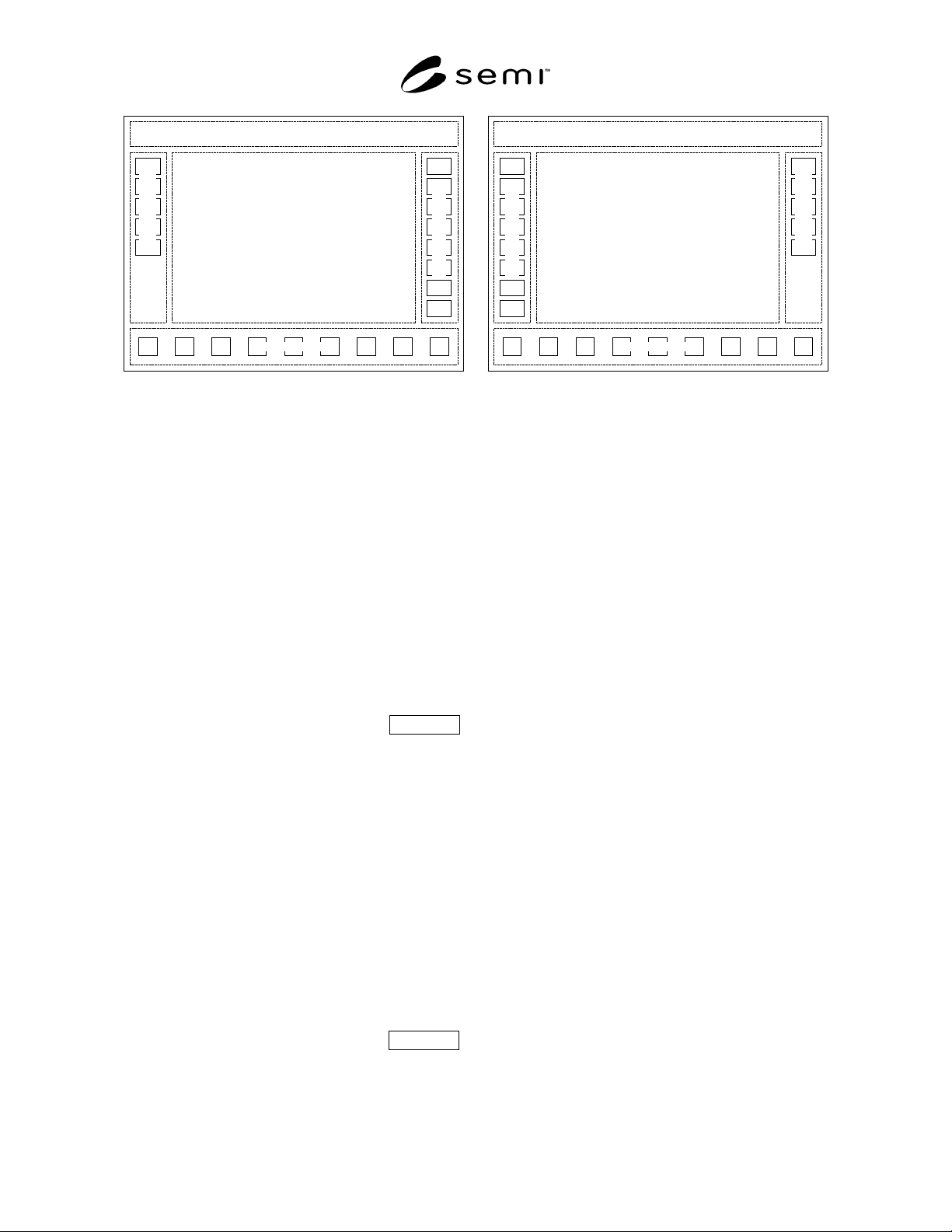
5.4.8.2 Sub-navigation Layout A — Tabs
5.4.8.2.1 Shown below are two orientations of the layout (right-hand and left-hand command panels), with sub-
navigation using tabs. This is the preferred method for new designs where more than one view per functional area is
needed. User selection of a tab brings the tab to the front, displays its information and command panel, and allows
the user access to its display objects. Use of tabs in each functional area must be consistent throughout the interface,
even if there is only one view in a functional area, and thus, one tab.
Title Panel
Information Panel
Command Panel
N
avigation Panel
View 1 View 2 View 3 View 4 View 5 View 6
Title Panel
N
avigation Panel
Command Panel
Information Panel
View 1 View 2 View 3 View 4 View 5 View 6
(a) (b)
Figure 17
View Sub-navigation Using Tabs
5.4.8.3 Sub-navigation Layout B — Sub-navigation Panel With Buttons
5.4.8.3.1 Shown below are two orientations of the layout, with sub-navigation using view selection buttons in a sub-
navigation panel. The figure shows one possible relative location for a sub-navigation panel, but is not intended to
restrict implementation. Other arrangements are allowed. However, if a sub-navigation panel is used, its size and
location in each functional area must be consistent throughout the interface, even if there is only one view in a
functional area, and thus, no buttons in the panel.
SEMI E95-1101 © SEMI 2000, 200113
Title Panel
Information Panel
Command Panel
Navigation Panel
Subnav. Panel
Title Panel
Information Panel
Command Panel
Navigation Panel
Subnav. Panel
(a) (b)
Figure 18
View Sub-navigation Using Buttons in Separate Panel
5.4.8.3.2 It is important in the layout to separate sub-
navigation methods from the global commands in the
command panel. This limits the number of buttons
needed in the command panel; and reduces or elim-
inates the need for multiple columns of buttons, which
would alter the information panel display aspect ratio.
If an information panel has a different aspect ratio than
the others, its contents may appear to “jump” sideways
when navigating, distracting the user. The separation of
sub-navigation from commands accomplishes two
important objectives; a) users do not become confused
trying to differentiate sub-navigation from commands,
and b) the aspect ratio of the information panel display
is consistent for all views across all functional areas.
5.5 Information Panel Mandatory
5.5.1 The information panel displays a view or views
of the information and graphics for each functional
area. Graphics and other display objects are placed in
this panel to achieve the control and monitoring
capabilities required. If necessary, multiple views of
information may be displayed within a functional area,
one at a time, in the information panel.
5.5.2 When any functional areas have more than one
view, the user must be able to switch between those
views while remaining within the context of the current
functional area. The ways the user may select among
multiple views presented in this standard are called sub-
navigation methods to distinguish them from user
navigation between functional areas using the
navigation panel.
5.6 Command Panel Mandatory
5.6.1 The command panel is a vertical column of
command buttons located to the right of the infor-
mation panel (to the left if switched to accommodate
left-handed users). Only buttons for common or global
commands related to the current view displayed in the
information panel shall be located in the command
panel. If there are no common commands for an infor-
mation panel, the command panel shall have no but-
tons. Each view in a functional area shall have its own
command panel. To limit the number of command but-
tons needed in each command panel, user selection of a
different view shall display that view and its associated
command panel, with commands that apply only to the
selected view. A command panel may be used for more
than one view if it is suitable for that purpose.
Command buttons or other display objects that have a
more limited scope shall be located in the information
panel. Restricting locally-acting commands and
functions to the information panel makes clear to the
user that only general, global commands are located in
the command panel. Buttons for navigation (i.e., that
invoke the display of another view in the information
panel) shall not be located in the command panel. It is
recommended that multiple columns of buttons in the
command panel be avoided.
6 Compliance Statement
6.1 In order to be compliant with this specification, the
documentation accompanying an equipment shall in-
clude a Human Computer Interface (HCI) Compliance
Statement that accurately indicates compliance with the
individual requirements defined in this document.
Requirements and recommended capabilities are
defined in Table 2.
6.2 In order to be compliant with HCI, equipment must
meet all requirements in each of three categories, as
follows: