semi合集-English.pdf - 第6762页
SEMI S1-0701 E © SEMI 1986, 2001 9 Figure 8 Prohibit ion Symbol Surround Shape 9.10.3 Mandatory Action Su rround Shape (see Figure 9) — A symbol located inside a m andatory action surround shape should be used to indicat…
SEMI S1-0701
E
© SEMI 1986, 2001 8
Figure 6
Safety Label with General Warning Symbol
9.8 Location — Symbols should be located on safety labels in the areas designated in the examples in Figures 2, 3,
and 4, or located in a similar manner. If multiple symbols are used on a multi-hazard safety label, the symbols
should appear in the same order as the safety information described in the word message.
EXCEPTION: Location of the safety alert symbol is governed by section 8.2.1.
9.9 Safety Alert Symbol — The safety alert symbol is composed of an equilateral triangle surrounding an
exclamation mark.
NOTE 15: See Figures 1 and 5 and Section 12.3.4 for format and color information.
9.10 Symbol Surround Shapes — Safety symbols should be shown in their appropriate surround shapes (see Figures
7, 8, and 9).
NOTE 16: This is for purposes of international harmonization. The surround shapes have been taken from ISO 3864 and IEC
61310-1.
9.10.1 Hazard Identification Surround Shape (see Figure 7) — A symbol located inside a hazard identification
surround shape should be used to indicate a personal injury hazard.
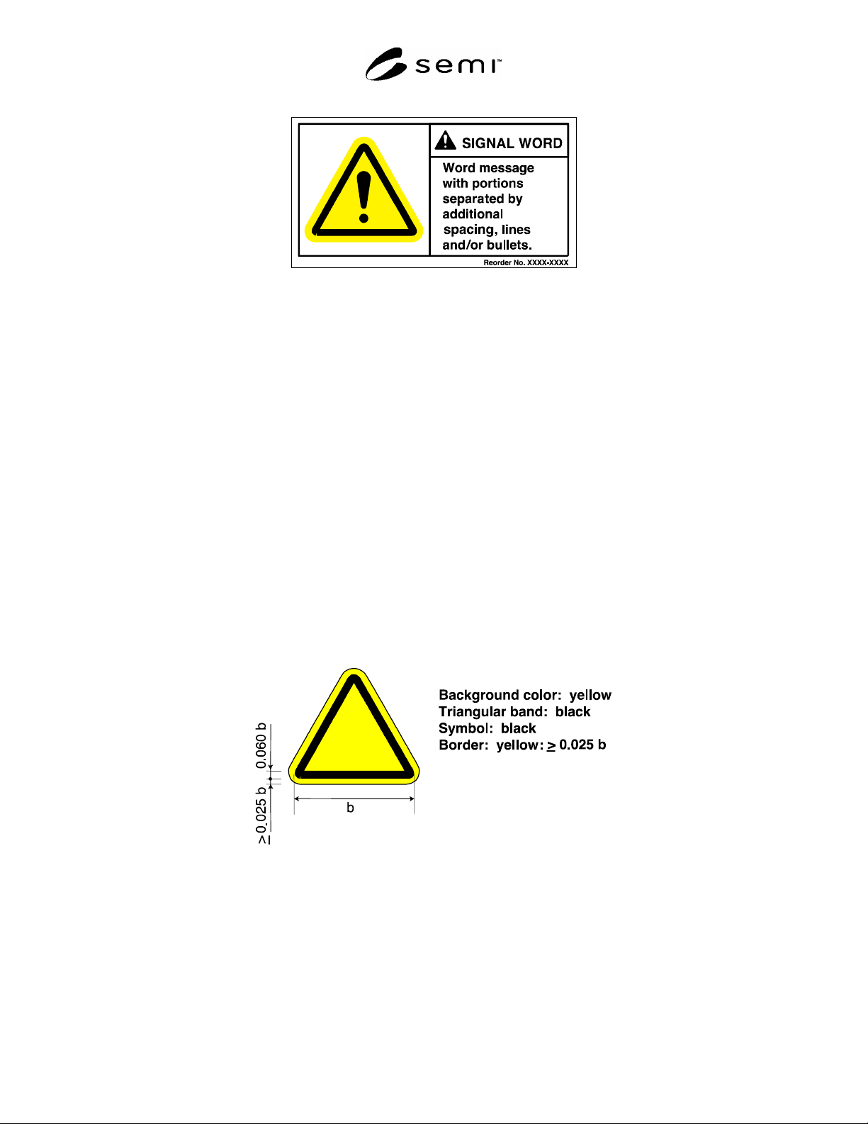
9.10.1.1 Format and Color — The background color should be yellow. The triangular band should be black. The
symbol or pictorial representing the hazard should be black. The border should be yellow; the border is optional if
the surrounding background is yellow or white. See Figure 7 for more information.
Figure 7
Hazard Identification Symbol Surround Shape
9.10.2 Prohibition Surround Shape (see Figure 8) — A symbol located inside a prohibition surround shape should
be used to indicate that an action should not be taken or should be stopped.
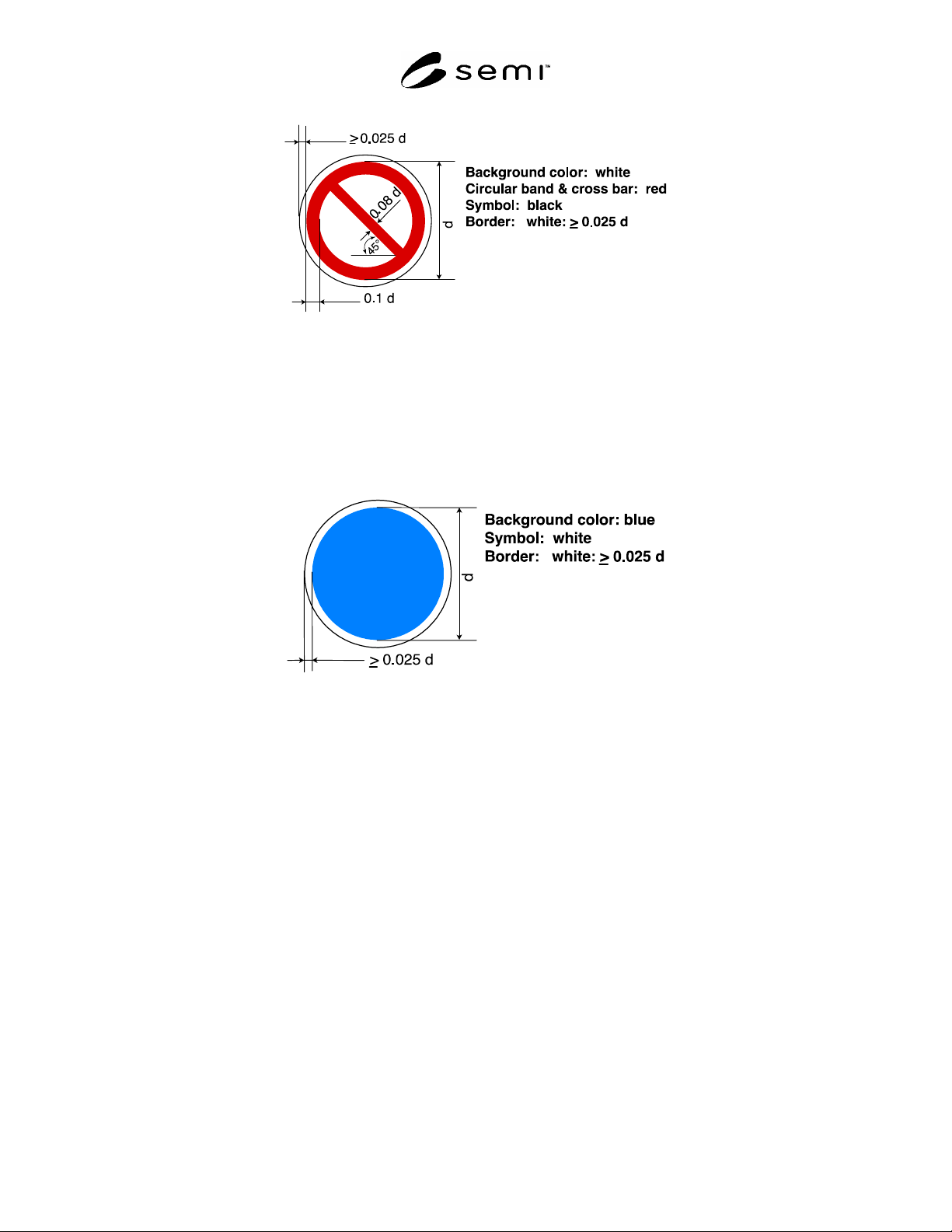
9.10.2.1 Format and Color — The prohibition surround shape should be a circular band with a diagonal bar. The
background color should be white. The circular band and diagonal bar should be red. The symbol representing the
prohibited action should be black and is preferably shown behind the red slash. The border should be white; the
border is optional if the surrounding background is white or yellow. See Figure 8 for more information.
SEMI S1-0701
E
© SEMI 1986, 2001 9
Figure 8
Prohibition Symbol Surround Shape
9.10.3 Mandatory Action Surround Shape (see Figure 9) — A symbol located inside a mandatory action surround
shape should be used to indicate that an action should be taken to avoid a hazard.
9.10.3.1 Format and Color — The background color should be blue. The symbol representing the mandatory action
should be white. The border should be white; the border is optional if the surrounding background is white. See
Figure 9 for more information.
Figure 9
Mandatory Action Symbol Surround Shape
10 Word Message
10.1 The word message is placed in the word message panel.
10.2 The word message preferably contains a description of the hazard, the consequence of engaging the hazard,
and how to avoid the hazard. The ordering of this content in the word message is flexible.
EXCEPTION: Parts or all of the word message may be omitted, depending on such factors as whether the message
can be inferred from a symbol, other text messages, user training, or the context in which the safety label is used.
10.3 The word message on a safety label should be concise and readily understood.
10.4 Messages on the same safety label that warn of different hazards should be formatted, when feasible, to
prevent them from visually blending together. Bullets, lines, and extra line spacing are examples of such formatting.
10.5 When detailed instructions, precautions, or consequences would require a lengthy message, the message may
alternatively refer the reader to another source for additional safety information. Examples of such sources include
safety instructions, operation and maintenance manuals, service manuals, operating procedures, and safety bulletins.
11 Lettering
11.1 Signal words should be in the lettering style shown in Appendix 2.

SEMI S1-0701
E
© SEMI 1986, 2001 10
11.2 For languages using the “Roman” alphabet, such as the official languages used in the Americas and in much of
the European Union, the lettering should be a combination of upper- and lowercase sans serif letters. Uppercase only
lettering may be used for short messages or for emphasis of individual words.
NOTE 17: Preferred Roman sans serif lettering styles include those named Arial, Arial Bold, Folio Medium, Franklin Gothic,
Helvetica, Helvetica Bold, and Univers.
11.3 Lettering should be of a size that enables a person with normal vision, including corrected vision, to read the
safety label at a safe viewing distance from the hazard.
NOTE 18: Related Information 1 provides an example of a method of calculating minimum letter heights.
NOTE 19: The proportions and spacing of individual letters also affect readability.
12 Colors
12.1 Color Specifications — Colors should conform to those colors specified in ISO 3864.
NOTE 20: For purposes of reproduction, the closest PANTONE
color match for opaque safety colors is:
Red – PANTONE 485
Orange – PANTONE 152
Yellow – PANTONE 109
Blue – PANTONE 2945
(PANTONE
is a registered trademark of Pantone, Inc.).
NOTE 21: Perceived color will be different under colored light (e.g., “yellow room”) conditions. The committee knows of no
current technical solution.
12.2 Symbol and Surround Shape Color Specifications — See section 9.10 for symbol and surround shape color
criteria.
12.3 Signal Word Panel — The three signal words should be colored as follows (see Figure 5):
12.3.1 The word DANGER should be in white letters on a red background.
12.3.2 The word WARNING should be in black letters on an orange background.
12.3.3 The word CAUTION should be in black letters on a yellow background.
12.3.4 Safety Alert Symbol — The solid triangle portion should be the same color as the signal word lettering, and
the exclamation mark portion should be the same color as the signal word panel background.
12.4 Optional Use of Red — The color red may be used in a symbol to indicate heat or fire.
13 Placement
13.1 Location of Safety Labels — Safety labels should be permanently attached to the equipment and, when
possible, located near the hazard.
13.2 Safe Viewing Distance — Safety labels should be placed to allow the viewer enough time to:
be informed by the safety label; and
have sufficient time to avoid the hazard or take appropriate evasive action to reduce the potential harm from the
hazard.
13.3 Placement — Safety labels should be placed so that they are legible, non-distracting, and not hazardous in
themselves.
13.4 Inadvertent Removal, Visual Blockage — Safety labels should not be located in areas where they may be
removed by the motion of equipment or rendered ineffective by situational conditions.
13.4.1 Safety labels should not be blocked from view by moveable panels such as doors, windows, and racks where
this would limit the effectiveness of the blocked label.