semi合集-English.pdf - 第2654页
SEMI E95-1101 © SEMI 2000 , 2001 9 5.3.11 Title Panel with Additional Infor mation Recommended 5.3.11.1 Sho wn below is an example of a lay out for the title panel incorp orating so me recommended display obj ects and th…
SEMI E95-1101 © SEMI 2000, 2001 8
5.3.8 Title Panel Description
5.3.8.1 The title panel is a horizontal area above the information and command panels, at the top of the interface
window. It is always displayed and contains the host communications status display (if host communications is
supported), date/time display, Login/Logout button (if security is supported), message display area, and the name of
the current view. It may optionally contain a corporate identifier or logo, a display of critical parameters, an audible
alarm silencing button, orientation graphics, a light tower representation, and other items that should always be
displayed to ensure effective operation.
5.3.9 Title Panel Basic Information Mandatory
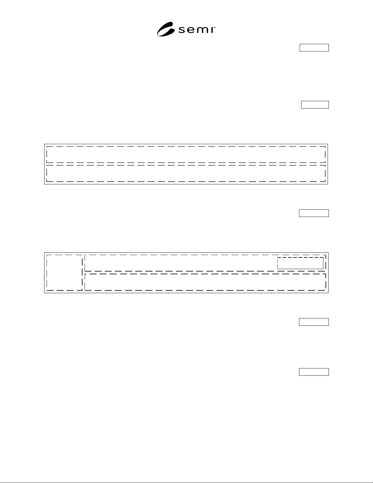
5.3.9.1 Shown below is the title panel with the mandatory display objects. The relative positions shown, with the
top portion of the title panel containing the date/time display at the left, the current view name to its right, and with
the message area below the top portion, are mandatory.
Date/Time
Display
Message Area
Current View Name
Figure 10
Title Panel
5.3.10 Title Panel with Conditional Information Conditional
5.3.10.1 Shown below is the title panel with the mandatory display objects, plus the conditional host
communications status display and the conditional Login/Logout button. The relative positions shown, with the host
communications status display left-most, and the Login/Logout button at the upper right, are mandatory.
Host
Communication
Status
Login Here
Date/Time
Display
Message Area
Current View Name
Figure 11
Title Panel
5.3.10.2 Title Panel Host Communications Status Conditional
5.3.10.2.1 If the equipment supports host communication then status information shall be included in the title panel.
Information such as communications status (i.e., whether communications is active), communications state (i.e.,
connected, disconnected, etc.), and whether the equipment is in a local or remote mode may be displayed here. The
display of specific information is dependent on the host communication protocol which may impose additional
specific requirements on what is displayed.
5.3.10.3 Title Panel Login/Logout Button Conditional
5.3.10.3.1 The Login/Logout button label reads “Login Here” until a user is logged in, then displays a user
identifier until the user logs out. User selection of the Login/Logout button invokes a dialog box where the user may
enter a user identifier and password, or, if already logged in, may select a button to log out. If required by the
implementation, when this dialog box is displayed, all other functions in the interface window may be disabled,
including the navigation panel.
SEMI E95-1101 © SEMI 2000, 20019
5.3.11 Title Panel with Additional Information Recommended
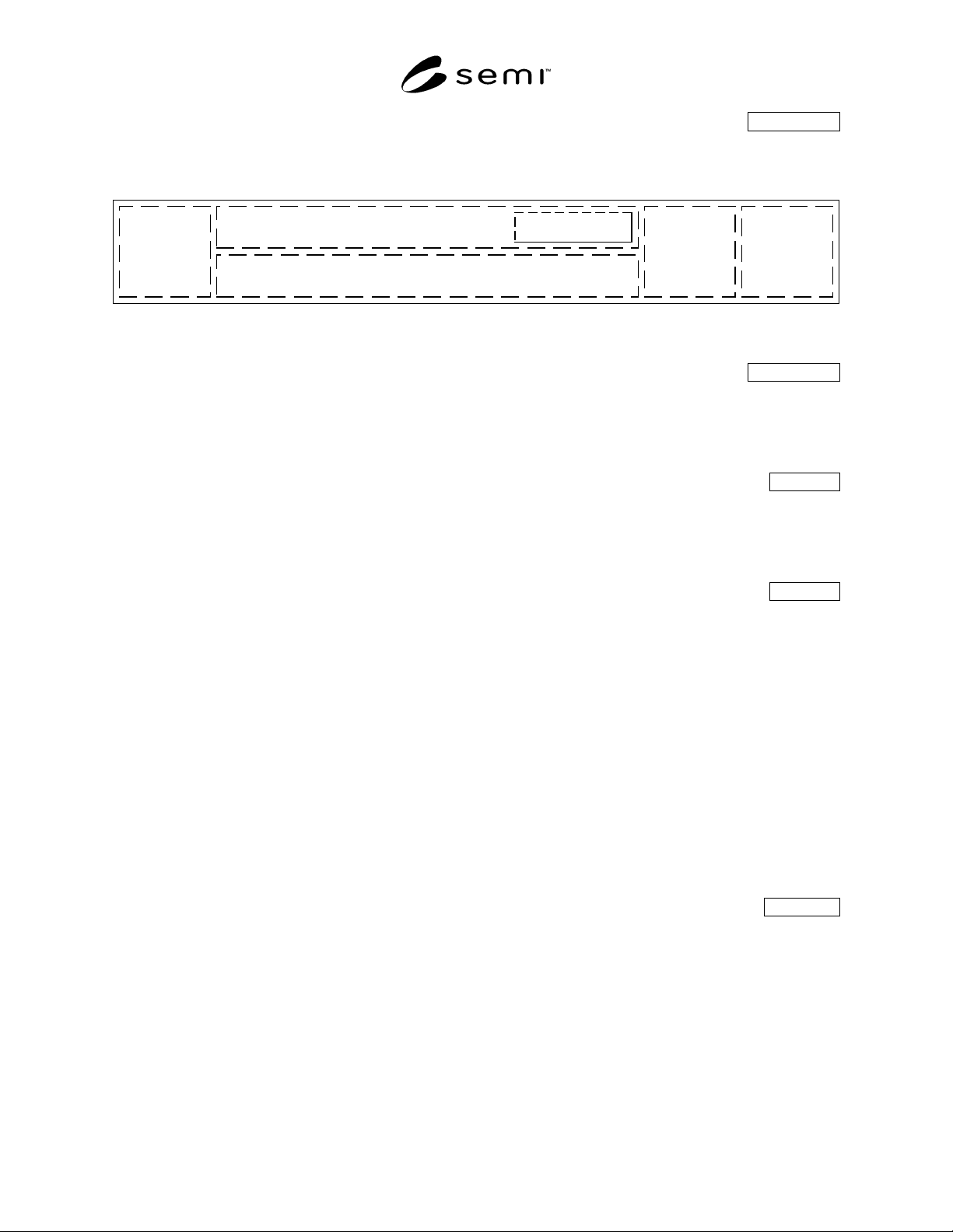
5.3.11.1 Shown below is an example of a layout for the title panel incorporating some recommended display objects
and their relative positions.
Host
Communication
Status
Login Here
Date/Time
Display
Message Area
Current View Name
Corporate
Identifier
Light Tower
Display
Critical
Parameters,
Alarm
Silencing,
etc.
Figure 12
Title Panel with Some Additional Display Objects
5.3.11.2 Title Panel Alarms Button Recommended
5.3.11.2.1 Although not recommended for new designs, the title panel may also contain an Alarms button that
allows the user to respond to cautions and severe alarms. In this case, the Alarms navigation button in the navigation
panel shall be omitted, and any alarms accessed through a title panel Alarms button shall be displayed in a dialog
box, not as an information panel and its command panel.
5.4 Navigation Panel Mandatory
5.4.1 Navigation buttons shall have a text label. In addition, they may also include an icon to graphically represent
their function. When no icon is present, the button label shall be centered on the button. If an icon is present, the
label shall be centered below the icon. Navigation buttons are arranged horizontally along the bottom of the display,
in the navigation panel, which shall always be present.
5.4.2 Required Navigation Functions Mandatory
5.4.2.1 At a minimum, the user shall always be able to immediately access and respond to alarm and caution
notifications, even when a dialog box is displayed on the current view. Dialog boxes shall not obscure the navigation
panel. Additionally, the user shall always be able to immediately access other parts of the interface if such access is
required to ensure the safe operation of the equipment. Only when prohibited by the operating system or other
implementation limitations such that a displayed dialog box cannot be maintained during, or redisplayed after
navigation, it is allowed that such access may be accomplished by displaying another dialog box that completely
covers the originally displayed dialog box. When the overlaying dialog box is dismissed, the underlying dialog box
is redisplayed, in the same state it was in prior to the invocation of the overlying dialog box (i.e., given the stated
prohibition or limitations, it is not mandatory that access be provided through navigation using the navigation
panel). Immediate access shall mean that the user shall not have to dismiss or otherwise interact with any displayed
dialog box in order to perform the required access. When the user navigates back or otherwise returns from the
required access, the last selected view shall be displayed, along with any dialog box that was displayed, in the same
state it was in. If no dialog box was displayed, the last selected view shall be displayed.
5.4.2.2 An allowed exception is a login and/or logout dialog box or screen if an implementation requires modal
operation while logging in or out.
5.4.3 Conditional Navigation Functions Conditional
5.4.3.1 Except when absolutely prevented by the operating system or implementation limitations, the navigation
panel shall always be available for user selection, even when a dialog box is displayed on the current view. This
makes it possible for the user to directly and immediately access any functional area from anywhere within the user
interface. Immediate access shall mean that the user shall not have to dismiss or otherwise interact with any
displayed dialog box in order to perform the required access. When the user navigates back to a functional area, the
last selected view is displayed, along with any dialog box that was displayed, in the same state it was in.
5.4.3.2 An allowed exception is a login and/or logout dialog box or screen if an implementation requires modal
operation while logging in or out.
SEMI E95-1101 © SEMI 2000, 2001 10
5.4.4 Navigation Panel Layout Mandatory
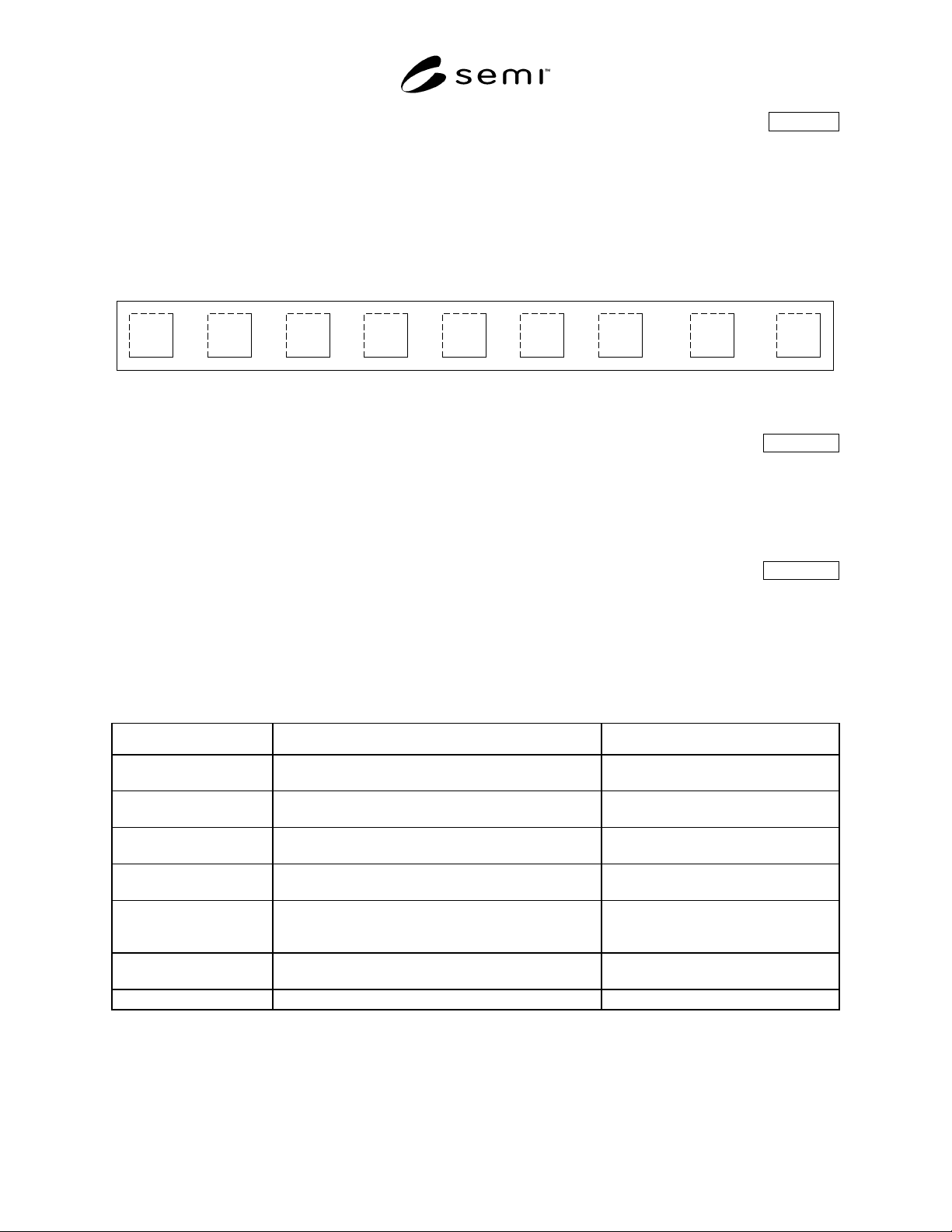
5.4.4.1 The figure below shows the navigation panel, with three buttons labeled “(Future)” indicating the positions
where buttons may be placed if required by the specific implementation of the interface, or as a result of
modifications or enhancements in future releases of the software. It is recommended that the navigation panel
contain no more than ten buttons.
5.4.4.2 The navigation buttons shall be sequenced from left to right in descending order of expected frequency of
use. The most frequently selected navigation button shall be left-most within the navigation panel; and the least
frequently selected button shall be right-most.
Jobs System Recipes Setup (Future) (Future) (Future) Alarms Help
Figure 13
Navigation Panel
5.4.5 Navigation Panel Alarm and Help Buttons Conditional
5.4.5.1 The two exceptions to the above ordering are the Alarms and Help navigation buttons, which, when they are
supported in an implementation, shall be the next to right-most and right-most buttons, respectively. This placement
ensures that the position of these buttons shall remain unchanged, even if subsequent interface modifications or
enhancements require additional buttons. The Alarm button shall be placed so that the spacing between it and
adjacent buttons is larger than the spacing between other buttons, to allow its selection quickly, and without error.
5.4.6 Navigation Button Labels Conditional
5.4.6.1 For each functional area, there is a corresponding navigation button identified by a text label (mandatory)
and icon (recommended) identifying the functionality and information provided. The table below shows text labels
(conditional) for the navigation buttons, a description of each functional area, and some recommended alternative
labels.
Table 1 Functional Areas
Navigation Button Label Description Alternate Labels
Jobs Operations related to product processing, including
any pre- and post-production equipment setup
Lot Operations, Operation,
Operations, Processing, Main, Run
System Equipment status, manual move, maintenance, service,
calibration, & other engineering-level functions
Overview, Service, Status, System
Status, Maintenance
Recipes Recipe management, including creation, editing,
storing, etc.
None
Datalog Data histories, event logs, SPC functions
(If supported)
History, Analysis, Logs, Data
Setup User account administration, host communications
control, user preferences, parameters, hardware
configuration/options, light tower programming, etc.
Configuration, Options
Alarms Alarm and caution summary to acknowledge and clear
posted alarms, current event log
None (see Section 5.4.5)
Help Help files on operations, procedures, and the interface None (see Section 5.4.5)
5.4.6.2 The top to bottom ordering of the table reflects the left to right ordering of navigation buttons. Also allowed,
but not recommended for new designs, is a left to right ordering of: System, Jobs, Equipment Setup, Recipes,
History, Maintenance, and Configuration. The alternative labels specified in the table may be applied to this